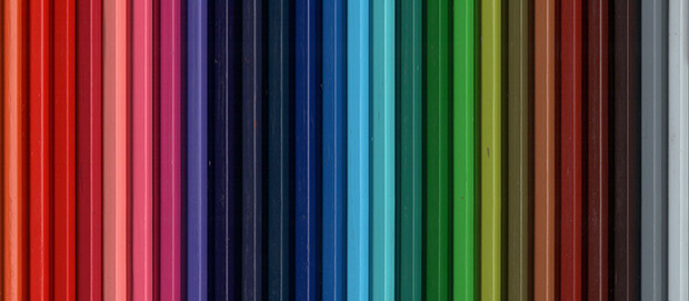
Colour meaning
Using colours well in your home can alter your and your family’s moods and emotions. It’s all a matter of perspective but below you’ll find a brief summary of the most common interpretations
What’s the theory then?
Colour psychology is the study of how colour impacts on human behaviour, including how colours can influence mood and emotions as well as even cause physiological reactions. Some colours have been shown to increase the blood pressure, increase metabolism, and cause eyestrain. Colour can be used to provide confidence and stimulate action (red), inspire calm (blue), symbolise growth and harmony (green) or imply purity and cleanliness (white). However, bear in mind that colours often have different interpretations, based on culture or individual interpretation, so your perception of the impact of a colour in your house may be different to that of guests’. It may be worth considering the meaning or multiple meaning of a colour you’d like to use in your home, especially if it’s a bold one.
Here's a brief summary of the generally accepted meanings of colours:
Red: A warm colour often thought to stimulate the mind and body, provide confidence and encourage action. It is obviously an intense colour that can evoke strong emotions such as love, anger, excitement and fear of danger

Orange: considered an energetic colour due to its component colours – red and yellow. Often used to draw attention in advertising and signage orange implies feelings of excitement and enthusiasm with many colour psychologists considering it to promote feelings of warmth and optimism
Yellow: A bright colour representative of the sun; yellow is considered warm, cheerful and optimistic. However, yellow is fatiguing to the eye due to the high amount of light reflected and can also create feelings of frustration and anger; studies show that people are more likely to lose their tempers and babies tend to cry more in yellow rooms
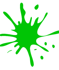
Green: Obviously everyone’s all heard of someone being green with jealousy but green is also associated with growth and renewal, tranquillity and health. Green is also known to relieve stress and have a calming effect – probably why chat show guests often wait in the “green room”
Blue: studies have shown it can reduce the pulse rate and temperature which is why it is used to promote feelings of serenity and calm, however it can also be a cold colour and promote feelings of sadness or conservatism
Purple: the colour of wealth and royalty – probably because it rarely appears in nature. It is also the colour of imagination and can imply creativity or individuality but perhaps also immaturity
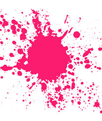
Pink: associated with love and nurturing but also implying girliness and silliness, pink is now mostly relegated to small girls' bedrooms. It is however a warm colour and can be used subtly to good effect in the right shade
Grey: the colour of compromise from a colour psychology perspective (being neither black nor white), it can be considered clinical and detached. However it also works as a great backdrop to a multitude of accent colours
White: the colour of purity and perfection. However many would consider it to be cold, sterile and utilitarian. In interior design white can enhance a feeling of spaciousness and, like grey, act as a fantastic backdrop
Brown: evokes feelings of warmth and comfort and is considered to be natural and down-to-earth.